Work / Call for Tender
Red Cross – Designing for Crisis & Emergency Triage
Designing a field triage application for the International Red Cross to manage casualties during natural disasters. A project focused on rapid intervention, offline resilience, and reducing cognitive load under extreme stress.
The Challenge
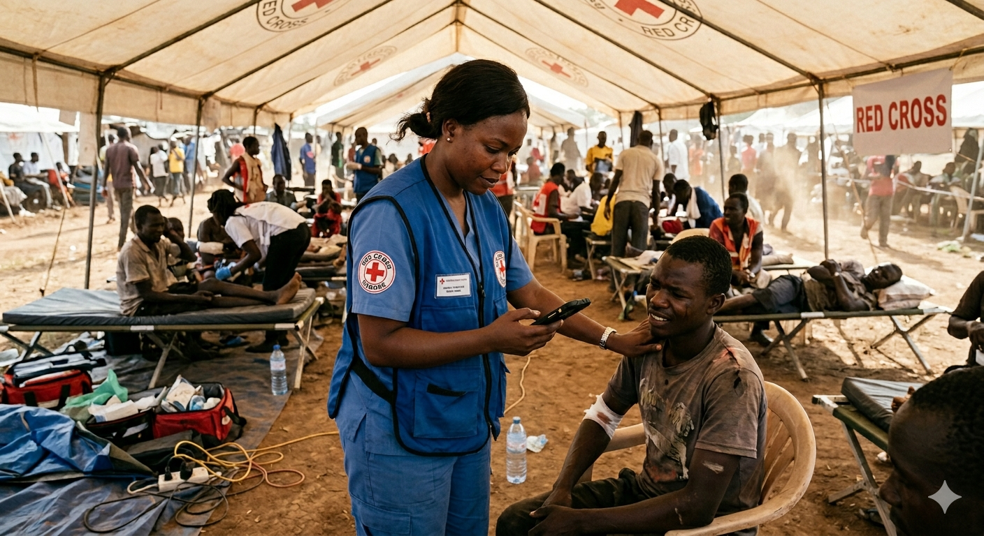
As part of a Call for Tender for the International Red Cross, the objective was to design a field application to support casualty management during natural disasters.
In these environments, triage must be extremely fast, accurate, and resilient to infrastructure failure. Medical staff operate under extreme stress, often in temporary camps with unstable or no connectivity.
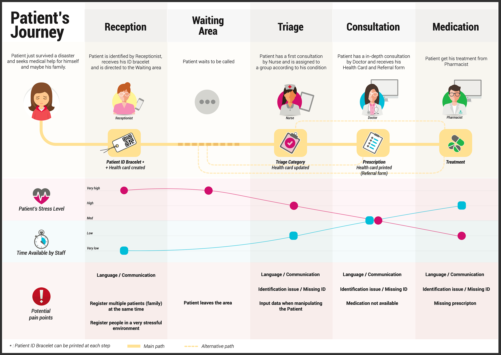
The challenge was to design a system that could support both initial triage by nurses in the field and deeper medical consultation by doctors, anywhere in the world.
My Role
I led the UX design phase and defined the core product concept presented during the tender.
- check_circle UX Strategy: Defining the information architecture to meet the needs of two distinct user types.
- check_circle Concept Lead: Creating the product vision that won the contract against the competition.
The Strategy
My strategy relied on the adaptability of a unique hybrid platform offering two specialized experiences:
Designing for Two Realities
The key insight was that the system needed to support two radically different contexts:
- fast, high-pressure, low-context field triage
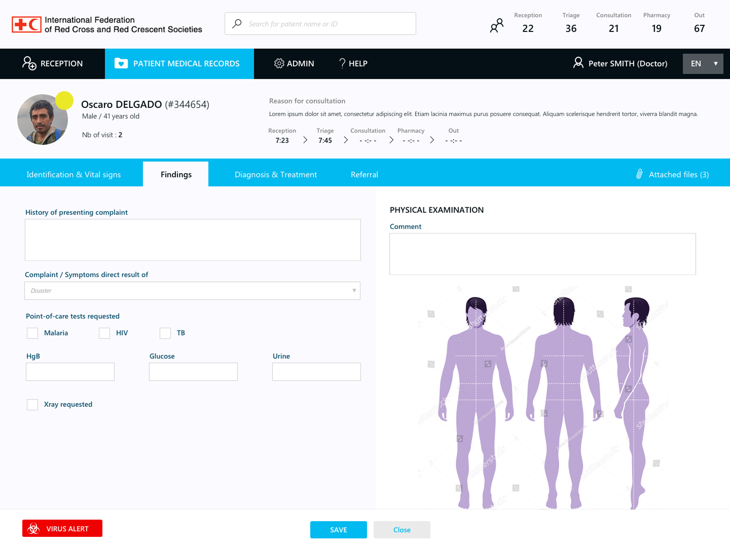
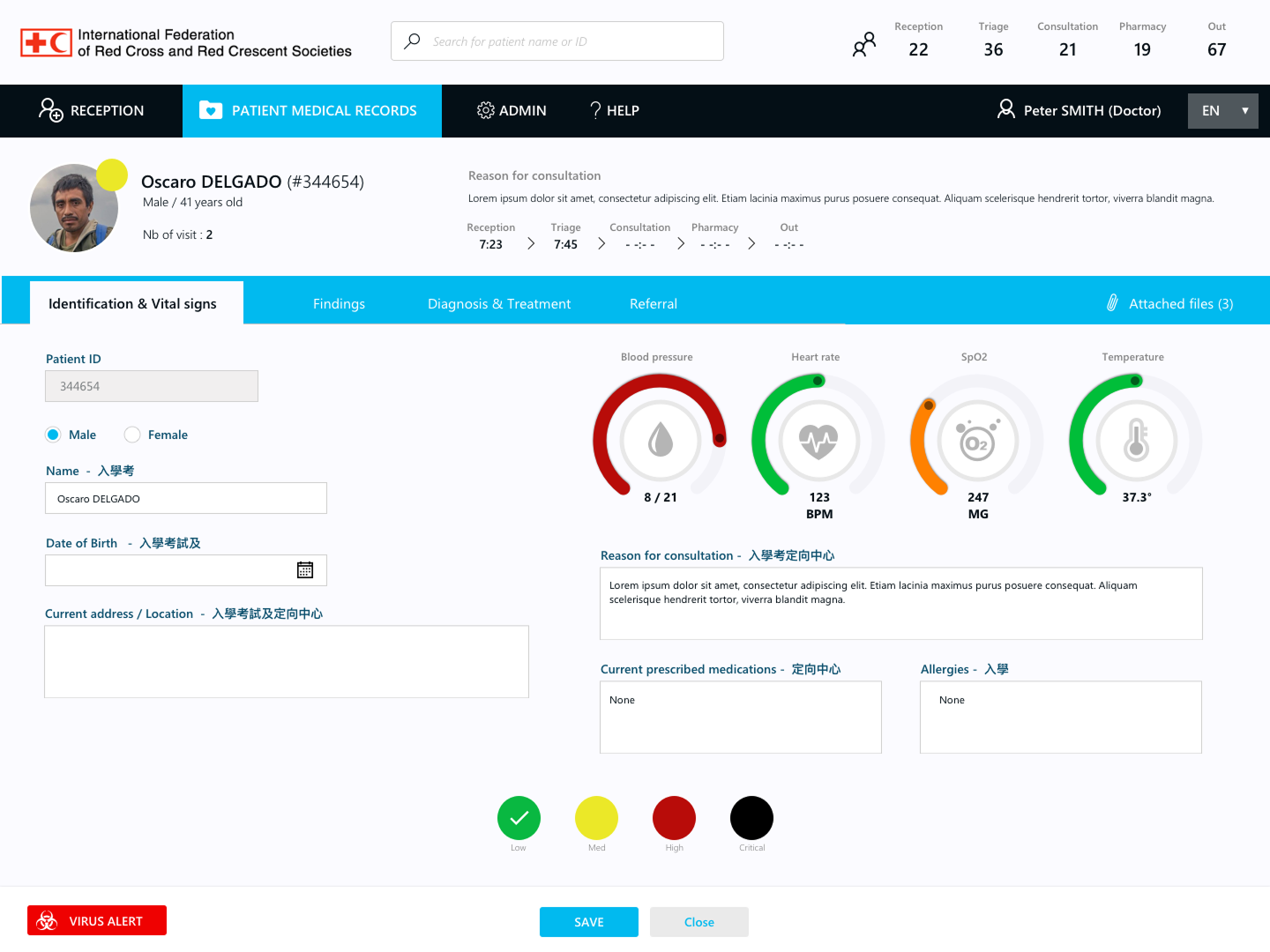
- structured, data-rich clinical consultation
This led to a dual-mode approach, rather than a single unified interface.
Resilience as a Core Principle
Beyond usability, the system had to operate under severe constraints: offline environments, unstable connectivity, and multilingual emergency response teams.
We designed with resilience as a primary UX requirement, not a technical afterthought.
Execution
The execution focused on reducing cognitive load and technical reliability:
Field Mode (Mobile-first)
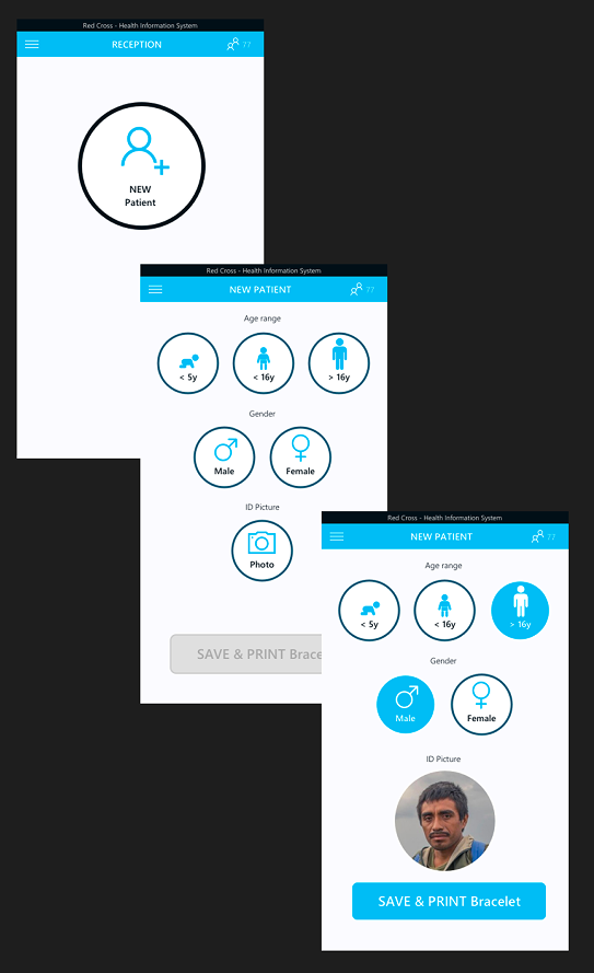
A minimal, highly constrained interface designed for nurses performing rapid triage under pressure. The focus was on speed, clarity, and error reduction in high-stress environments.
Clinical Mode (Web App)
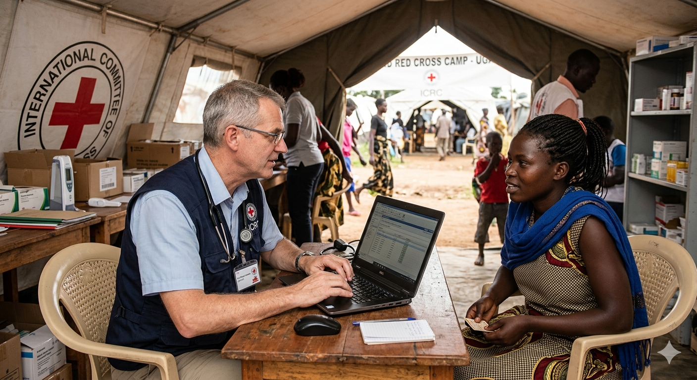
A richer interface designed for doctors, enabling full access to patient history and enabling deeper medical analysis and follow-up.
Adapting the Identification System
One of the most important moments in the project came during discussions with medical staff. An early concept explored facial recognition to help identify injured patients quickly in the field. However, after speaking with a nurse experienced in emergency contexts, it became clear that the idea was unrealistic. Smoke, unstable lighting conditions, dirt, and facial injuries would make facial recognition unreliable precisely when reliability mattered most. We pivoted toward a far more resilient solution: printed barcode wristbands assigned directly during triage. While technically simpler, the approach proved significantly more robust and operationally adapted to real crisis environments.
System Foundations
We also defined critical system principles such as offline-first synchronization and multilingual support to ensure continuity of care in global crisis contexts.
Outcomes
Winning Concept
The UX concept was a key differentiator that led Atos to win the international tender against a competitor proposing an existing product requiring heavy customization. In contrast, our proposal was a fully tailored solution, designed specifically around the realities of emergency care workflows.
Scalable Architecture
Although I did not work on the implementation phase, the concept and UX foundations were used by the delivery teams to build the final product.
Human Impact
DA design approach rooted in real human constraints — supporting caregivers in the most critical and high-pressure environments.
Reflection
This project reinforced a principle that sits at the core of my practice: design only matters when it serves human conditions, not interfaces.
We did not spend weeks polishing visual details or crafting a highly refined UI. The prototype remained intentionally mid-fidelity throughout the tender process because the real challenge was not aesthetic sophistication, it was operational clarity. What convinced stakeholders was the strength of the concept itself: a system genuinely designed around the realities of emergency care, field constraints, and human stress.
It also reinforced the importance of confronting ideas with real-world expertise as early as possible. Features that initially seemed innovative (like facial recognition) quickly collapsed when exposed to the realities of disaster environments. The best decisions often came not from adding complexity, but from simplifying toward reliability. Looking back, I’m proud that a relatively simple prototype, grounded in strong UX reasoning and real human constraints, was enough to win an international tender against far more established solutions.