Case Study / Business Intelligence Platform
Appex360 — From Technical Monitoring to Business Intelligence
Reframing application monitoring from technical telemetry into a business-oriented intelligence platform.
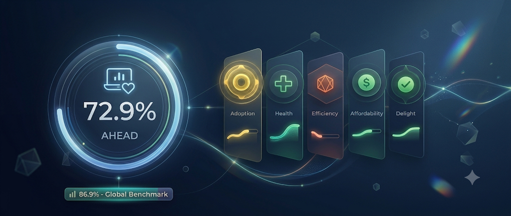
Appex360 transformed Nexthink’s legacy “Applications” module into a business-oriented platform helping Application Owners understand adoption, efficiency, cost, and employee sentiment across enterprise applications.
The Shift
Historically, the Applications module was designed for IT teams. Dashboards focused heavily on technical metrics:
- Crashes
- Performance
- Response time
- Infrastructure Health
Useful for diagnostics. But insufficient for business decision-making.
The Challenge
Application Owners struggled to derive value from technical data. They needed answers to critical business questions:
- — Is the application delivering actual ROI?
- — Is adoption healthy across regions?
- — Are license costs optimized for usage?
Moving from technical observability to business understanding.
My Role
Lead Product Designer
I led the product vision and end-to-end experience design of Appex360.
My role covered:
- check_circleproduct strategy
- check_circleUX architecture
- check_circleinteraction design
- check_circleAI interaction concepts
- check_circledashboard systems
- check_circlestakeholder alignment
- check_circlehands-on UI execution
This project required balancing enterprise complexity, business readability, scalability, and implementation feasibility while introducing an entirely new persona into the ecosystem: the Business Application Owner.
The Strategy: The AHEAD Framework
One of the biggest challenges was structural: How do you simplify dozens of technical and behavioral signals into something decision-makers can actually reason about? The answer became: AHEAD
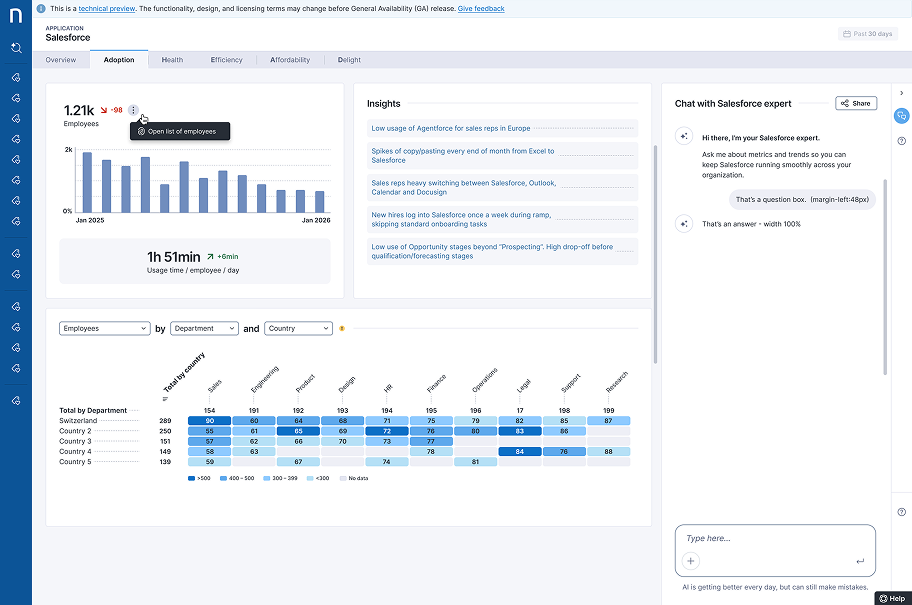
Adoption
Measuring actual usage tailored by app type.
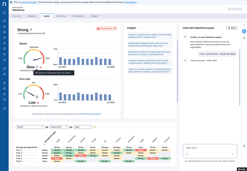
Health
Technical performance and stability.
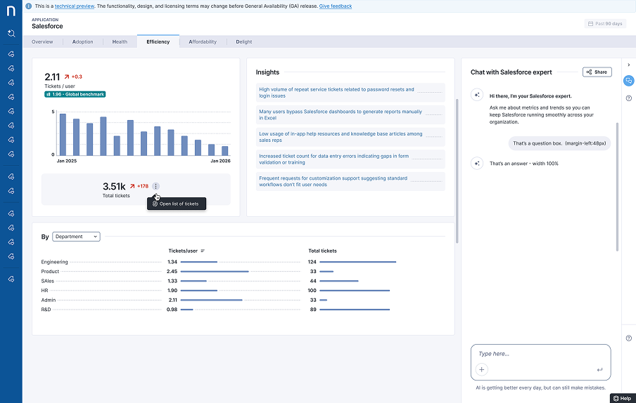
Efficiency
Operational effectiveness measured by IT support volume.
Affordability
Cost optimization via a customizable license management system.
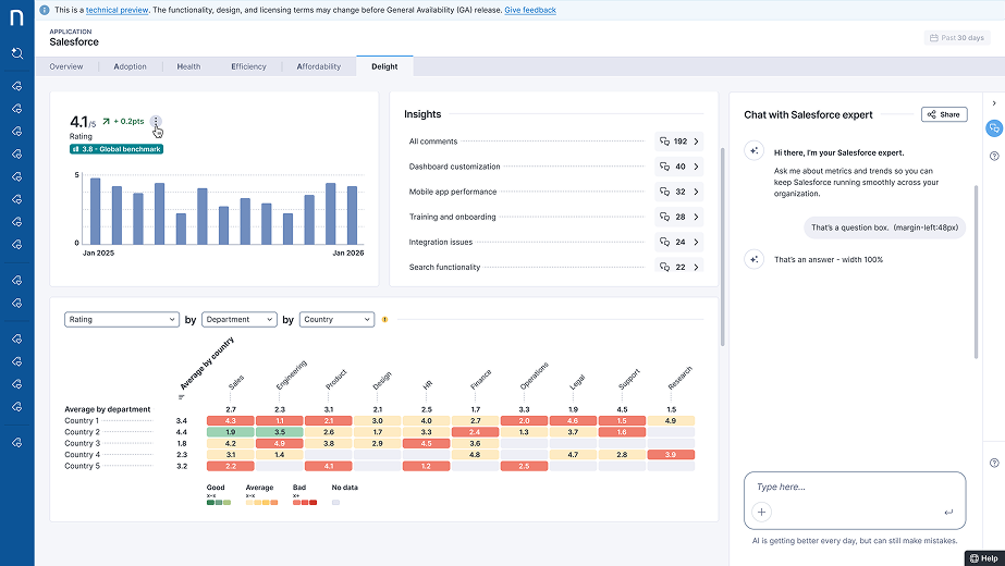
Delight
User satisfaction via integrated CSAT surveys and AI sentiment analysis.
Defining the Product Foundations
Translating technical telemetry into business language
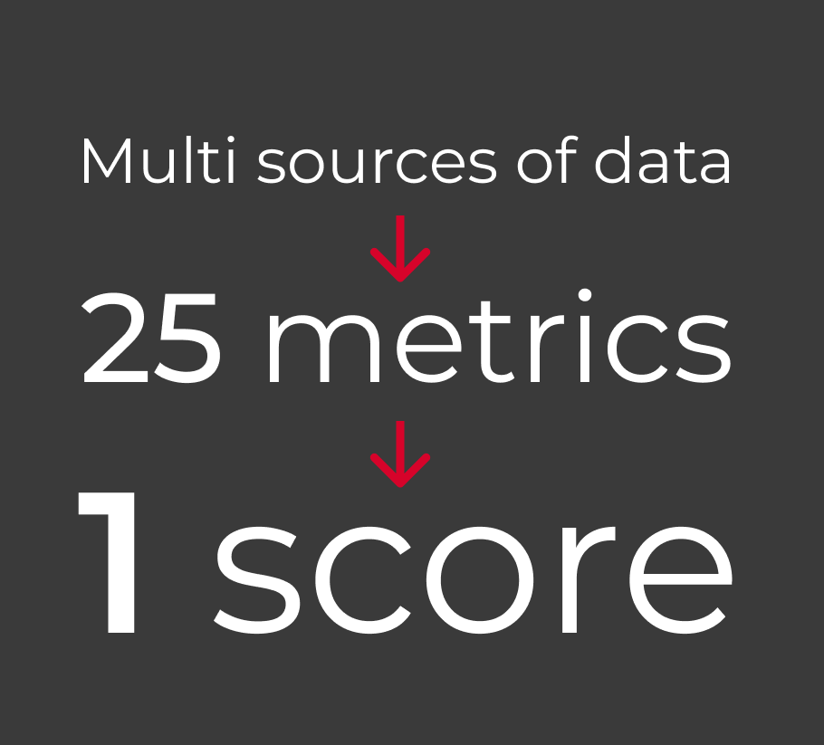
I defined a model to translate complex operational signals into business-readable KPIs. The AHEAD model synthesized multiple data streams:
- Telemetry & ServiceNow
- Software Metering
- Sentiment Analysis
- Benchmarking
The goal: A shared language for application value spanning performance, cost, and sentiment.
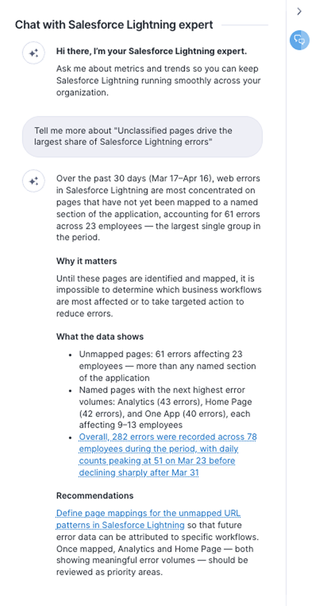
AI as an interaction layer
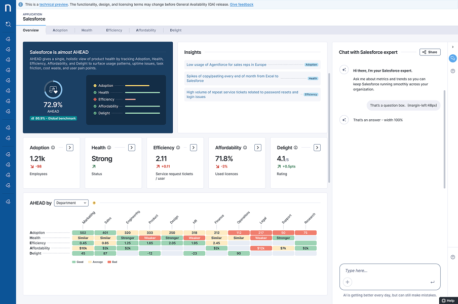
We introduced a contextual AI layer to interpret dashboard insights. Rather than a generic bot, ‘Chat with an Expert’ acts as an embedded analyst.
The assistant clarifies context, root causes, and suggests next actions, focusing on building user trust through transparency.
Interaction Models & System Trade-offs
Designing the AI interaction model

1. Floating Assistant
A floating assistant provided strong visibility and immediate access to AI interactions. However, in dense enterprise dashboards, it introduced a high risk of overlapping critical content and competing with existing floating UI patterns already used across the platform.

2. Embedded Widget
We explored integrating the assistant directly inside dashboard content to create a more contextual experience. While the approach felt tightly connected to the insights themselves, it introduced significant responsive and layout challenges, especially as we wanted the assistant to remain persistently visible across complex datasets and screen sizes.

3. Collapsible Side Panel
The final direction leveraged the existing sliding right-side panel already established in the product ecosystem. This approach created a clearer separation between data exploration and AI interpretation while maintaining persistent contextual access with minimal disruption to dashboard layouts. One trade-off remained: the panel could become unavailable when users opened online documentation, since both experiences relied on the same interaction pattern.
Navigation explorations & trade-offs
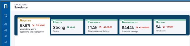
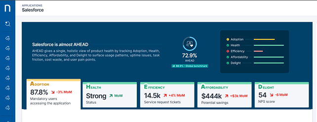
1. Large Tabs Layout
The first exploration focused on a large tab-based structure grouping all AHEAD pillars within a single navigation layer. While this approach provided strong visibility across sections, it lacked a clear overview and made it difficult for users to understand the overall application status at a glance.
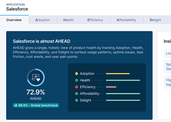
2. Overview + Large Tabs
The second iteration introduced a dedicated overview section combined with large sectional tabs. This improved contextual understanding and gave users a clearer entry point into the data. However, the layout created visual imbalance, scalability concerns, and responsive limitations as the platform complexity increased.
3. Structured Navigation
The final direction aligned with a more structured and familiar enterprise navigation model: one dedicated tab per AHEAD pillar. This approach improved hierarchy, scalability, and readability while remaining consistent with existing product navigation patterns, reducing cognitive load for users navigating dense datasets.
Rapid Prototyping with Figma Make
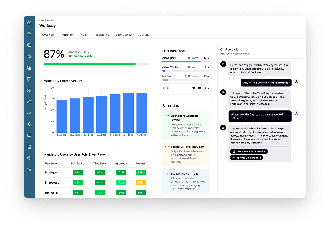
To accelerate exploration and validate interaction patterns early, I also used Figma Make throughout the project. It helped us quickly test content structure, navigation flows, and AI interaction concepts in a more realistic and interactive way than static mockups alone.
Because our existing design system was relatively outdated, it was not fully compatible with Figma Make’s generation capabilities. As a result, we intentionally avoided spending too much time pushing prototypes toward full visual fidelity. Instead, we focused on what mattered most at this stage: validating information hierarchy, interaction behaviors, and conversational flows before moving into production-ready design refinement.
Gallery
Outcomes & Impact
Expanded the product toward new business personas
Introduced a standardized framework for evaluating application value
Helped bridge technical telemetry and business decision-making
Established AI-assisted insight interpretation directly inside operational workflows
Successfully launched to 190+ customers
Contributed to an estimated $1.3M revenue opportunity (+6%)
Reflection
This project started as a redesign, but quickly became the creation of a new product concept. We moved from technical monitoring to a business intelligence layer, unifying multiple data sources into a single framework (AHEAD) and iterating extensively in Figma Make to shape both the system architecture and the AI interaction model.
What stayed with me most is how introducing a new persona, the Business Application Owner, fundamentally shifted the scope of the product and its impact. It turned a technical module into a business-facing platform, and in doing so, created tangible value beyond design for both customers and the company.