Case Study / Design Systems & AI
One Design System, from Figma to a Live App
An experiment: build a design system from scratch in Figma by driving it with Claude Code, then generate the matching React library in Storybook and a demo app that uses it — and keep all three in sync.
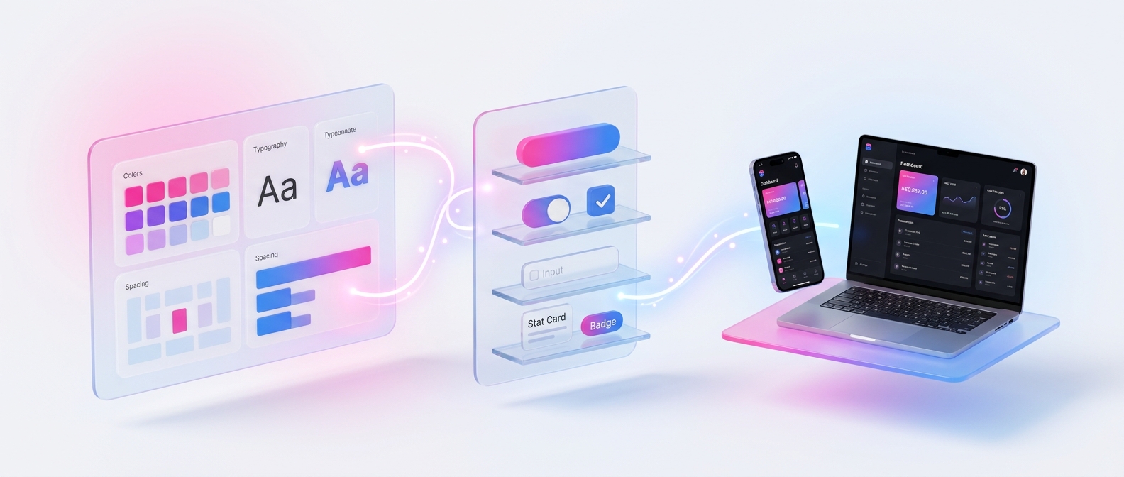
Figma, Storybook and the product usually drift apart. What if a single change in Figma could flow all the way to a live app?
The Goal
In most teams, the design system lives in three places — the Figma library, the component library in code and the product itself — and keeping them aligned is a constant, manual effort.
I wanted to see how far that chain could be automated. The starting point was an empty Figma file and a simple brief: a modern fintech look in the spirit of Revolut, with a pink-to-blue gradient, and Light/Dark and Desktop/Mobile handled by variable modes — not by duplicated components.
The aim: prove that, with code as the bridge, the sync Design System → Storybook → App can actually hold.
456
Figma variables in 4 collections
25
Figma components, no hard-coded values
22
React components in Storybook
43
automated tests across library and app
The Pipeline
Each layer feeds the next. Change a colour in Figma, re-export, run the script — and it propagates to Storybook and the app.
Figma
Variables, modes & components
JSON tokens
Exported from Figma variables
CSS variables
Generated by a script
React + Storybook
The component library
Demo app
Built only with the library
The Design System in Figma
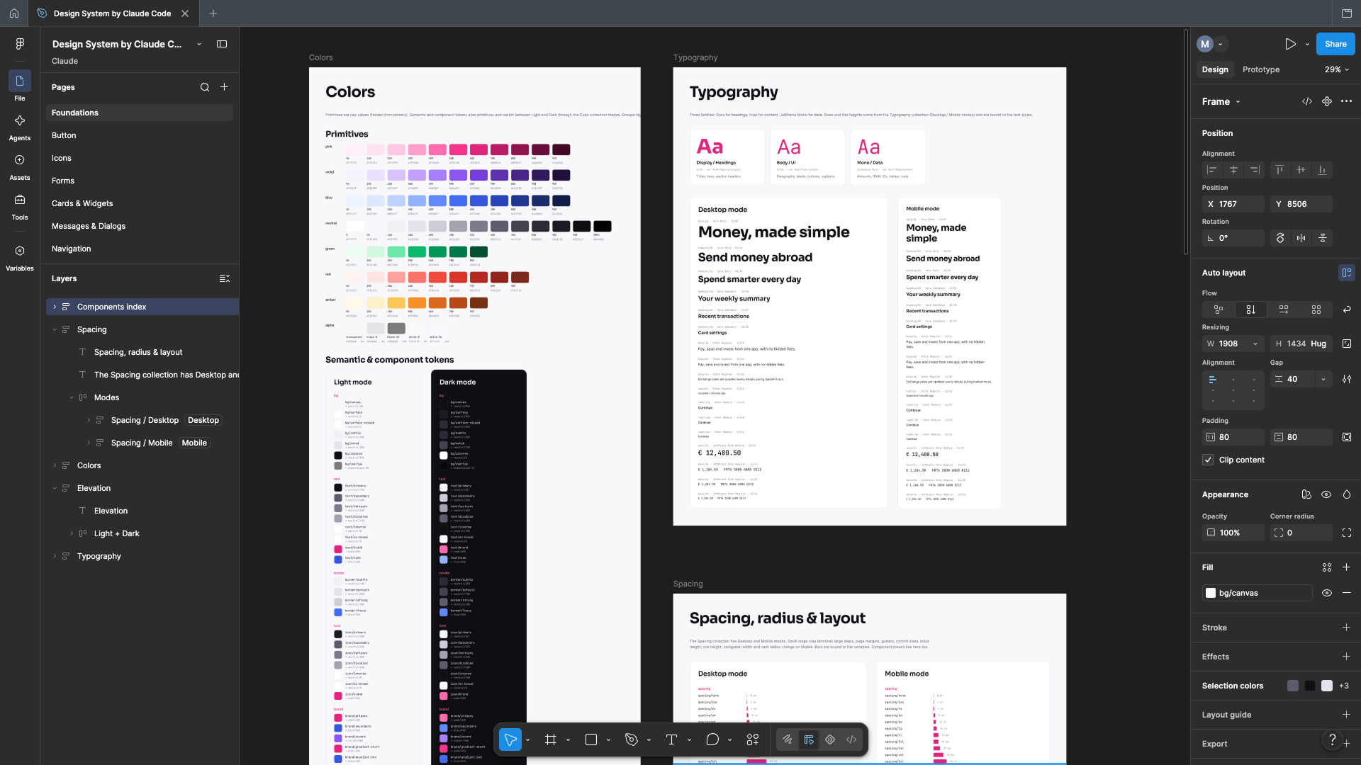
Built from an empty file, entirely through Claude Code and the Figma connector. Everything rests on 456 variables organised in four collections, each with its own modes:
Primitives
Raw palettes (pink, violet, blue, neutral, green, red, amber), spacing, radii, font sizes and line heights.
Color Light / Dark
Semantic tokens (bg/surface, text/primary…) and component tokens, all aliased to primitives.
Spacing Desktop / Mobile
Scale, page margins, gutters and control sizes — an input grows from 44 to 48px on mobile, a dialog shrinks from 480 to 342px.
Typography Desktop / Mobile
Three typefaces — Sora for headings, Inter for content, JetBrains Mono for data — and 17 text styles bound to variables.
- widgets25 components, all bound to variables — no hard-coded values. The Button alone has 60 variants (style × size × state).
- menu_bookDocumentation in the file: a Foundations page, review pages for every family in Light/Dark × Desktop/Mobile, and a Patterns page with rules and Do/Don't.
From Variables to Code
The Figma variables are exported to a JSON file, and a script turns them into CSS variables. Figma modes become simple attributes on the page:
- dark_mode
data-themefor Light / Dark - devices
data-devicefor Desktop / Mobile
Nothing is copied by hand: a token changed in Figma reaches the code with one export and one script.
The React Library in Storybook
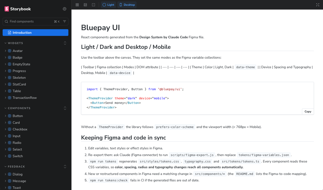
Claude Code then built the web components matching the Figma library: 22 React and TypeScript components, plus a theme provider.
- accessibility_newInteractive components (Dialog, Tabs, Tooltip, Checkbox, Radio, Switch, Toast) rely on Radix for focus, keyboard and accessibility.
- auto_storiesOne story per component and variant, with toolbar toggles for Light/Dark and Desktop/Mobile.
- paletteDocumentation pages for the tokens — colours, typography, spacing.
Guardrails to Keep It in Sync
A sync that nobody checks drifts. So the library comes with safety nets:
32 tests
Components, accessibility roles — and one that fails if a component uses a variable missing from the tokens.
Drift check
Detects when the generated files no longer match Figma.
Code Connect
25 mappings linking Figma components to their code — configured, not yet published.
A Demo App Built Only with the Library
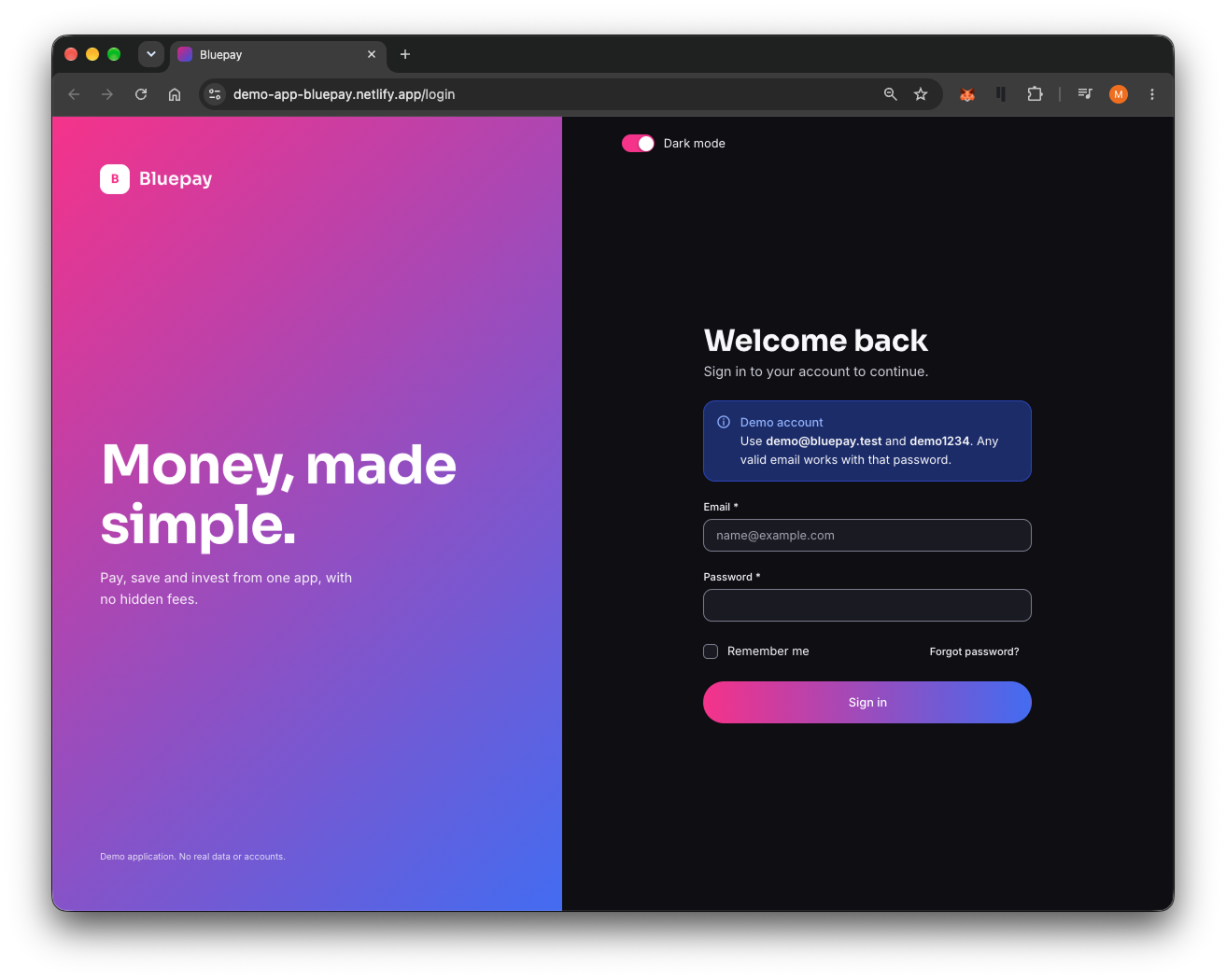
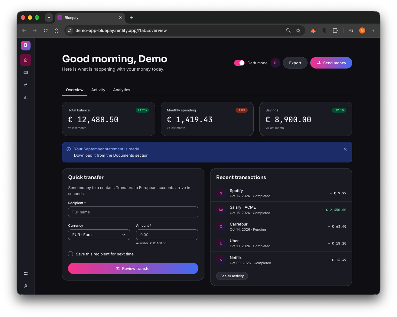
The final test: Bluepay, a small banking app (React, Vite, React Router) that uses nothing but the library's components.
- loginLogin — field validation, error message, loading state, a “forgot password” dialog and a dark-mode switch.
- dashboardDashboard — collapsible navigation, tabs, stat cards, a transfer form with confirmation and an “Undo” toast, and a table with search, filters, sorting, selection and confirmed deletion.
- hourglass_emptyLoading, empty and error states throughout, covered by 11 tests.
Checked in Light/Dark and Desktop/Mobile, then deployed on Netlify.
Key Design Decisions
Two Layers of Tokens
Primitives hold the raw values, semantic tokens hold their purpose. Components only use semantic tokens, so the whole style can change from a single place.
Modes, Not Duplicates
Light/Dark and Desktop/Mobile are Figma variable modes rather than duplicated components. One component, four contexts — in Figma and in code.
Tokens in Figma, Components in Code
The biggest question: where does each thing live? My answer — keep the tokens in Figma, but make code the source of truth for components, protected by guardrails: no hard-coded values, a manifest, and a defined path for adding new tokens.
Thinking Multi-Platform
Web, Android, desktop: shared tokens across all platforms, common components where it makes sense, and platform-specific components where it doesn't.
My role vs. the tool
This was built with Claude Code, driving Figma through its connector. Claude did the heavy lifting of execution.
My part was the direction: the brief and the visual style, the token architecture, the decisions on what lives where — and reviewing every step along the way.
Current limits
- Code Connect is configured but not yet published.
- Icons are hand-drawn SVGs, not a proper icon set.
- The Select component still uses the native browser element.
- No Android or desktop library yet — only web.
Reflection
The sync Figma → Storybook → App holds — not because of a magic plugin, but because of a clear architecture: two layers of tokens, modes instead of duplicates, and guardrails that catch drift before it reaches the product.
AI makes building the whole chain fast. Deciding where each thing should live is still the designer's job.