Work / Luxury Digital Platform
Roger Dubuis – Data over Dogma in Luxury Design
Redesigning the digital platform for a high watchmaking icon to create an immersive, high-performance brand experience capable of converting a new generation of international clients.
The Challenge
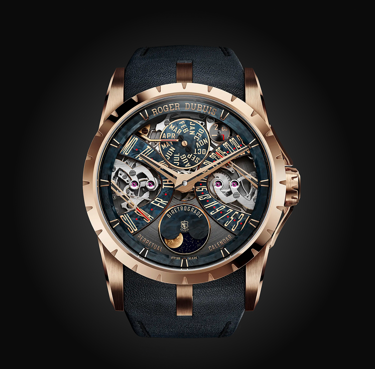
Roger Dubuis is a high watchmaking icon defined by bold visual identity and strong Swiss luxury conventions. During the redesign of their digital platform, a clear tension emerged: the organization strongly favored a desktop-centric experience, aligned with traditional luxury web standards and historical client expectations.
However, global analytics revealed a very different reality: over 70% of traffic came from mobile, particularly from international audiences in Asia. This created a gap between internal perception and actual user behavior.
The challenge was not only to redesign the experience, but to shift a deeply rooted product belief, from desktop-first assumptions to a mobile-first reality, without diluting the brand’s premium positioning.
My Role (UX Specialist)
I led the UX strategy with a focus on data-informed design decisions and mobile interaction design.
- check_circle Data-Driven Decisions: I used deep data analysis to guide design decisions, moving the team past assumptions.
- check_circle User Testing & Collaboration: Led user tests to validate bold ergonomic choices, and worked closely with Visual Designers to ensure beauty never sacrificed usability.
The Strategy
My strategy relied on two critical pillars: the undeniable truth of the numbers and a deep understanding of the brand's DNA.
From Assumptions to Evidence
Usage data clearly showed that mobile was the primary entry point for the majority of users. This became the main lever to reframe internal discussions and justify a mobile-first approach in a context where desktop was historically considered the “primary” experience.
Brand Duality
Focused on balancing "Hyper-Premium" aesthetics with "Expressive Design" to attract clients seeking exclusivity and boldness.
Understanding Real Mobile Behavior
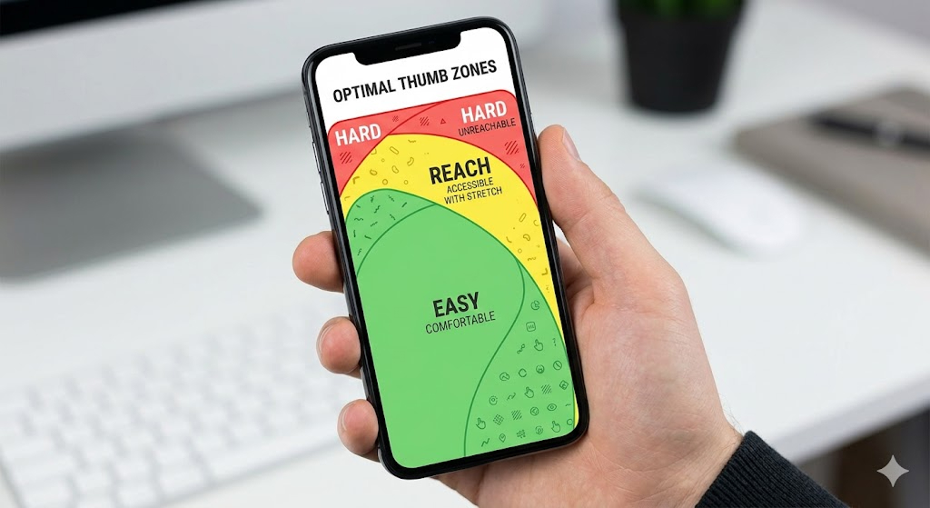
To go beyond analytics, I conducted a situational UX study observing users interacting with smartphones in real contexts. One key insight emerged: mobile usage is not binary. Users constantly switch between one-handed and two-handed interactions depending on environment, attention, and intent.
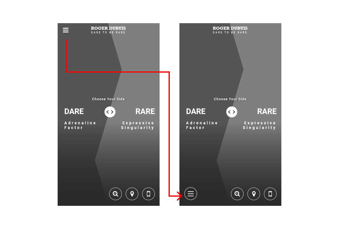
This insight directly challenged an early design assumption I had about placing all key interactions in the bottom zone of the screen. Instead of enforcing a rigid ergonomic model, I adapted the interaction strategy to reflect real user flexibility.

Execution
The final product is where luxury design meets modern ergonomics:
Breaking the Dogma
Our field study proved users are highly agile; by placing key functional elements in the less conventional top area, we freed up critical screen space to highlight stunning brand imagery.
Responsive Visual Storytelling
We crafted a vibrant, dynamic interface that brings the brand's core 'duality' concept to life across all devices and screen sizes.
Interaction Patterns
Implemented navigation patterns that respect the natural hand gestures and touch areas we observed during our extensive user research.


Outcomes
Strategic Alignment
Successfully reoriented the project from a desktop-centric vision to a mobile-first experience grounded in real-world usage data.
Ergonomic Freedom
Rigorous user testing allowed us to confidently integrate disruptive design elements without compromising intuitive navigation.
Brand Elevation
Delivered a comprehensive digital platform that accurately reflects and amplifies the creative boldness of Roger Dubuis.
Reflection
This project reinforced a key lesson: in luxury digital experiences, the strongest resistance to change is often not technical, but cultural. The initial debate around mobile-first was less about UX principles and more about perception, what stakeholders believed users should do versus what they actually do. What changed the conversation was not opinion, but evidence: combining analytics with real-world observation made the case for mobile-first undeniable.
It also challenged my own assumptions as a designer. My initial instinct to centralize all key interactions at the bottom of the screen felt “correct” from a pure UX standpoint, but real user behavior proved more nuanced. People adapt fluidly to context, posture, and device handling. Good design should reflect that adaptability rather than constrain it. Ultimately, this project was less about enforcing best practices and more about learning when to question them.